
Slate 101 – Building a Leaderboard
June 10, 2020

Intro
Slate is the UI framework used to build the Unreal Editor user interface. Finding any sort of basic worked example of constructing such an interface using this framework, however, is not that easy. As we have been using Slate extensively in our internal tooling for some time, as well as when customising the editor on client projects, we decided that producing a ‘Slate 101’ would be of benefit to the wider Unreal community.
Rather than attempt to analyse and explain some part of the Unreal Editor UI, we will be demonstrating some basics of constructing a UI layout in Slate using a simple implementation of an in-game leaderboard. Slate is not typically used for in-game UI, but, starting with a blank screen allows us to just focus on laying out the code from start to finish.
Building Our Leaderboard
In describing the implementation of a simple leaderboard we will first demonstrate how to divide the viewport into horizontal and vertical boxes to define the leaderboard area. Then we will populate the leaderboard with a title, some column headers and finally the score rows. The application of custom colours and fonts, and how to insert images, are also demonstrated.
The entirety of the code used in this post is available from our GitHub. Several other key UE4 concepts are also used in the example code but not discussed in detail here such as:
Slate Style Sets
Data Tables
Game Plugins
The key building block of Slate is the widget and all classes ultimately derive from SWidget. A widget handles four main behaviours, determining the required size of the widget (ComputeDesiredSize()), arranging any children (ArrangeChildren()), drawing the widget (OnPaint()), and dealing with events such as user mouse clicks. Most events, but not all, have simple default implementations. All events can be customised, though, usually via delegate bindings. The basic setup of a widget is done through overriding the Construct() function. As we are inheriting from SCompoundWidget in our example, the majority of this setup involves adding child widgets to the ChildSlot member declared in the base class.
In Unreal terminology the GameViewport consists of the full window area which, by default, has an overlay widget (SOverlay) covering 100% of the screen. As we want to show UI with the live game in the background, the overlay widget needs to be divided up. This is done using SHorizontalBox and SVerticalBox widgets. These widgets are simple containers that can be subdivided into slots (horizontal or vertical sub-containers as appropriate). The width (SHorizontalBox) or height (SVerticalBox) of these slots can be customised using weighted values. Throughout this post we use a decimal value between 0 and 1 to define our slot sizes, though any internally consistent relative scaling may be employed.
Consider Figure 1 and the accompanying code snippet. Here, an SVerticalBox is divided into three slots and the heights of each set to a percentage of the available screen area.
ChildSlot
    [
      SNew(SVerticalBox)
        + SVerticalBox::Slot() //Slot 1
        .FillHeight(0.15f)
        [
          SNullWidget::NullWidget
        ]
        + SVerticalBox::Slot() //Slot 2
        .FillHeight(0.7f)
        [
          // Space for further code.
        ]
        + SVerticalBox::Slot() //Slot 3
        .FillHeight(0.15f)
        [
          SNullWidget::NullWidget
        ]
    ];
We have now divided the Viewport into two slots consisting of 15% each, and another of 70%. Note that the contents of the slots is set to SNullWidget::NullWidget. SNullWidget is a bare bones class containing a static instance of an empty, invisible widget (NullWidget) which satisfies the requirement that each slot must contain content. The middle slot is the one we are interested in and will be further subdivided with an SHorizontalBox (Figure 2) to form the screen area for the leaderboard.
ChildSlot
    [
      SNew(SVerticalBox)
        + SVerticalBox::Slot()
        .FillHeight(0.15f)
        [
          SNullWidget::NullWidget
        ]
        + SVerticalBox::Slot()
        .FillHeight(0.7f)
        [
          SNew(SHorizontalBox)
          + SHorizontalBox::Slot() //Slot 1
          .FillWidth(0.20f)
          [
            SNullWidget::NullWidget
          ]
          + SHorizontalBox::Slot() //Slot 2
          .FillWidth(0.60f)
          [
            // Space for further code.
          ]
          + SHorizontalBox::Slot() //Slot 3
          .FillWidth(0.20f)
          [
            SNullWidget::NullWidget
          ]
        ]
        + SVerticalBox::Slot()
        .FillHeight(0.15f)
        [
          SNullWidget::NullWidget
        ]
    ];
ChildSlot
[
SNew(SVerticalBox)
+ SVerticalBox::Slot()
.FillHeight(0.15f)
[
SNullWidget::NullWidget
]
+ SVerticalBox::Slot()
.FillHeight(0.7f)
[
SNew(SHorizontalBox)
+ SHorizontalBox::Slot()
.FillWidth(0.15f)
[
SNullWidget::NullWidget
]
+ SHorizontalBox::Slot()
.FillWidth(0.70f)
[
SNew(SVerticalBox)
+ SVerticalBox::Slot() //Slot 1: AutoHeight()
.AutoHeight()
[
// Space for header code.
]
+ SVerticalBox::Slot() //Slot 2: 100% - AutoHeight(Slot1)
.FillHeight(1.0f)
[
// Space for table body code.
]
]
+ SHorizontalBox::Slot()
.FillWidth(0.15f)
[
SNullWidget::NullWidget
]
]
+ SVerticalBox::Slot()
.FillHeight(0.15f)
[
SNullWidget::NullWidget
]
]; In the code snippet shown above we are using AutoHeight() on the topmost Slot 1. This will adjust the height of the slot to the height of the largest Widget contained in it. In this case that will be the title with a font size of 60. Note that the height of Slot 2 is set to 1.0f (100%), but Slot 1 will also occupy some (undetermined, at this point) percentage of the overall height. An assignment of AutoHeight() takes precedence over a manually defined height, resulting in the height of Slot 2 being 100% less the height of Slot 1.
ChildSlot
    [
      SNew(SVerticalBox)
        + SVerticalBox::Slot()
        .FillHeight(0.15f)
        [
          SNullWidget::NullWidget
        ]
        + SVerticalBox::Slot()
        .FillHeight(0.7f)
        [
          SNew(SHorizontalBox)
          + SHorizontalBox::Slot()
          .FillWidth(0.15f)
          [
            SNullWidget::NullWidget
          ]
          + SHorizontalBox::Slot()
          .FillWidth(0.70f)
          [
            SNew(SVerticalBox)
            + SVerticalBox::Slot() // Blue Slot 1
            .AutoHeight()
            [
              SNew(SHorizontalBox)
              + SHorizontalBox::Slot() //Red Slot 1
              .FillWidth(0.20f)
              [
                // Logo insertion code.
              ]
              + SHorizontalBox::Slot() //Red Slot 2
              .FillWidth(0.60f)
              [
                // Title insertion code.
              ]
              + SHorizontalBox::Slot() //Red Slot 3
              .FillWidth(0.20f)
              [
                SNullWidget::NullWidget
              ]
            ]
            + SVerticalBox::Slot() // Blue Slot 2
            .FillHeight(1.0f)
            [
              ColumnBox.ToSharedRef()
            ]
          ]
          + SHorizontalBox::Slot()
          .FillWidth(0.15f)
          [
            SNullWidget::NullWidget
          ]
        ]
        + SVerticalBox::Slot()
        .FillHeight(0.15f)
        [
          SNullWidget::NullWidget
        ]
    ];
The Vertical Slot 1 (Red Slot 1 in Figure 4) is further divided into three slots to allow the insertion of the icon on the left and the title in the middle. The actual code required to insert image and text widgets is not covered in detail here, but can be found on our GitHub. At this point we have every Box except the Column Headers themselves and the Rows, so let’s go ahead and add those.
Notice we set the contents of Blue Slot 2 to a shared reference of the variable ColumnBox (SHorizontalBox). This allows us to add widgets to this slot from anywhere this reference is available, but more importantly it allows us to add and remove slots during runtime. As ColumnBox is populated with widgets the UI will be automatically updated to reflect the changes.
void AddHeaderColumns()
{
  AddHeaderColumn(Position, 0.05f, LOCTEXT("Position", "#"));
  AddHeaderColumn(Country, 0.05f, LOCTEXT("Country", ""));
  AddHeaderColumn(PlayerName, 0.43f, LOCTEXT("PlayerName", "Name"));
  AddHeaderColumn(TotalScore, 0.12f, LOCTEXT("TotalScore", "Total Score"));
  AddHeaderColumn(Round1, 0.05f, LOCTEXT("Round1", "R1"));
  AddHeaderColumn(Round2, 0.05f, LOCTEXT("Round2", "R2"));
  AddHeaderColumn(Round3, 0.05f, LOCTEXT("Round3", "R3"));
  AddHeaderColumn(Round4, 0.05f, LOCTEXT("Round4", "R4"));
  AddHeaderColumn(TotalStrokes, 0.15f, LOCTEXT("TotalStrokes", "Total Strokes"));
}

void AddHeaderColumn(TSharedPtr<SVerticalBox> ColumnHeaderBox, float Size, const FText ColumnName)
{
  ColumnHeaderBox->AddSlot()
    .FillHeight(0.09f)
    .VAlign(VAlign_Center)
    .HAlign(HAlign_Center)
    [
      SNew(STextBlock)
      .TextStyle(&EntryTextStyle)
      .Text(ColumnName)
    ];

  ColumnBox->AddSlot()
    .FillWidth(Size)
    [
      // Populating
      ColumnHeaderBox.ToSharedRef()
    ];
}
In the above snippet we instantiate an SVerticalBox for each column needed. This SVerticalBox will act as a column with its first widget child being its own header.
The AddHeaderColumn() function shown above takes in a pointer to the SVerticalBox in addition to the width of the column to be added and the column name.
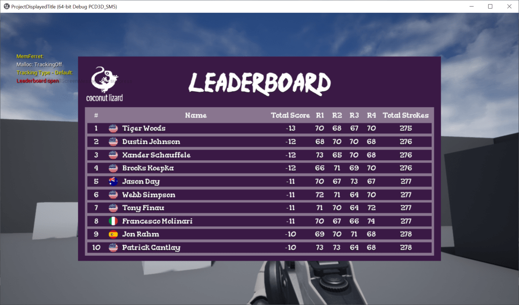
At this point it’s important to keep in mind how many rows we wish to be visible at any given time (per page, perhaps. If not, an SScrollView can also be added). We wanted a Top 10 Leaderboard so, including the headers, we have 11 rows. 100% / 11 = ~9%, hence the .FillHeight(0.09f).
After the header of the column has been added to the column, the column widget (SVerticalBox) is added to the horizontal box ColumnBox (See Fig. 4). For each row that is added to the column the ColumnBox will reflect the changes.
The only thing remaining now is to add the rest of the rows. In our case that is all the entries in LeaderboardDataTable (as we only have 10 entries).
void AddRows(UDataTable* LeaderboardDataTable)
{
  const FString ContextString = FString(TEXT("Leaderboard Data Table Context"));

  for (const FName& ColumnName : LeaderboardDataTable->GetColumnNames())
  {
    FLeaderboardItem* Item = LeaderboardDataTable->FindRow<FLeaderboardItem>(ColumnName, ContextString);
    if (Item)
    {
      Item->CalculateTotalStrokes();
      AddWidget(Position, Item->Position);
      AddWidget(Country, Item->Country);
      AddWidget(PlayerName, Item->Name);
      AddWidget(TotalScore, Item->TotalScore);
      AddWidget(Round1, Item->Round1);
      AddWidget(Round2, Item->Round2);
      AddWidget(Round3, Item->Round3);
      AddWidget(Round4, Item->Round4);
      AddWidget(TotalStrokes, Item->TotalStrokes);
    }
  }
} Credit(s): Martin Engelsgjerd (Coconut Lizard)
Help: Josef Gluyas (Coconut Lizard)
Github: https://github.com/CoconutLizard/LeaderboardSlateTutorial